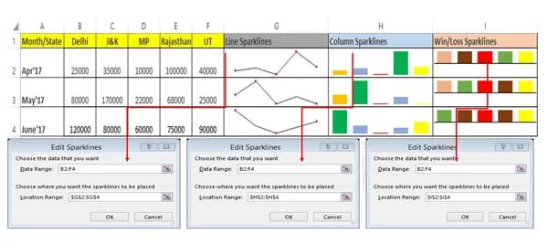
Sparklines in Excel is an important feature which allows you to view or print visual representation of numerical data. If you are working on Microsoft Excel 2010 or upper version then you can create a use sparklines in Excel to show data trends. Sparklines are smaller charts which is used to show numerical data in-terms of charts.
📌 Also Read: How to download Voter ID Card in Smartphone
💡 You might like: What is E-PASSPORT, Its FEATURES and How to Apply E-Passport
You can show different type of data trends as per your need. Graphical representation of numerical data gives a great impact than others. You can easily create or use line, columns or win loss sparklines in Excel to show data trends in active worksheet.
Must Read: Latest 7 Excel Tricks which makes you an Excel Expert
If you have data in-terms of tabular format than you can use Sparklines. You can choose any required style of sparklines to represent numerical data in graphical format. Sparklines are not objects just like the charts. Sparklines are the smaller charts which is shown inside a cell which shows the performance of data.You can view high point, low point, first, last and negative point of your sparklines. You can also able to edit the sparklines data, change the sparklines color, set different point colors as per your need. If you don’t want to keep any particular or group sparklines then you can easily clear selected sparklines.
Type of Sparklines in Excel
There are three types of sparklines in Excel. You can choose any required type as per your need to show the trends of numerical data.
1. Line Sparklines in Excel
It is used to display a simple line format in active cell. You can change the line sparklines color, style, marker color, turn on or off different points as per your need.
✅ Must Read: How to freeze or lock rows and columns in Excel at the same time
📌 Also Read: How to hide or lock personal chat on WhatsApp
2. Column Sparklines in Excel
This type of sparklines is used to show the numerical data in-terms of vertical bars. If you have positive number then column will goes on above the axis otherwise goes on below the axis.
3. Win/Loss Sparklines in Excel
This type of sparklines displays in the form of vertical bars just like column sparklines. But this type of sparklines is used to represent the profit or loss of your numerical data. If you have positive data or profit then bars goes above the axis. If you have negative data or loss then bars goes down the axis.
How to Create and Use Sparklines in Excel to Show Data Trends
If you have tabular format data and want to show the data trends then you must have to create and use sparklines in Excel. To create the sparklines in Excel you must have to take few given simple steps, have a look.

Step 1: Create or open an existing table in which you have tabular format data. Click on that cell where you want to show or insert the sparklines.
Must Read: Get the File Names from a Folder using Excel function
Step 2: Click on the Insert tab > Choose Line or Column or Win/Loss required format of sparklines. Select the data range from B2:F4 to choose the data that you want for sparklines.
Step 3: Choose the location range where you want the sparklines to be placed like $G$2:$G$4. Now Click on the OK button. As you view sparklines you will get an additional tab with the name of Design in sparklines tools. You can edit the data, change the sparklines type,turn on or off different point, change style, color and many more as per your need.
I hope after reading this guide you can easily create and use the sparklines in Excel to show the data trends. This feature helps you to show the numerical data performance in-terms of tiny charts. If you have any suggestion regarding this article then please write us in the comment box. Thanks to all.
💬 Loading comments...